
A knitwear motif can look perfect in Illustrator and still fail the moment it becomes fabric.
Maybe the lines get muddy. Maybe the “clean” logo warps the first time the chest panel stretches. Maybe your factory tells you it’s feasible, but the sample comes back heavier, itchier, or less crisp than you expected.
This guide is for the early stage: you’re building your first knit capsule (or adding knits to an existing line) and you want design inspiration plus the practical rules that keep motifs readable and manufacturable.
Motifs and graphic elements for knitwear: the quick definitions
In knitwear, motifs are patterns built into the fabric itself. They’re created with stitch structure (texture) or yarn color changes.
Graphic elements are broader. They include motifs, but also the parts that make a sweater feel branded or “designed” even when the knit is simple: engineered stripes, contrast ribs, custom labels, patches, embroidery, and trims.
If you’re new to development, the simplest mental model is this:
Texture motifs: the pattern is made by stitches you can feel.
Colorwork motifs: the pattern is made by color changes in the knitting.
Applied graphics: the pattern is added after knitting.
You’ll choose differently depending on budget, timeline, minimum order quantities, and how crisp the artwork needs to be.
The three motif families (and when each one wins)
1) Texture motifs (lowest risk, easiest to sample)
Texture motifs are built from knit and purl structures or relief stitches. Think ribs, seed stitch, basketweave, cables, pointelle panels.
Why they’re beginner-friendly:
They don’t depend on high-resolution “pixel art” planning.
They’re usually less sensitive to color matching.
They stay readable even when the garment stretches a bit.
If you want something that feels elevated without betting the whole sample on artwork translation, start here.
2) Colorwork motifs (high impact, more constraints)
Colorwork gives you the patterns people notice from across the room: Fair Isle bands, argyle diamonds, florals, pictorial motifs, and some logos.
This is also where a lot of animal and icon motifs live—dog motifs, cat motifs, horse motifs, anchor motifs, ski motifs, and golf motifs—often executed as intarsia or jacquard depending on edge crispness, inside feel, and speed.
Colorwork is where most first-sample surprises happen. Not because factories can’t knit it. Because your design is now tied to technical realities like gauge (stitch size), yarn behavior, and what happens on the inside of the garment.
A key constraint to know early: some machine setups strongly favor stripes over complex patterning, because of how the knitting motion and yarn feeders work. CottonWorks notes that feeder and automatic circular knitting machines have limitations, and stripes are often the primary pattern option in those setups (complex patterning needs other capabilities or approaches) in CottonWorks’ “Designing Knit Textiles” (2026).
3) Applied graphics (when you need crispness)
If you need fine lines, small type, or a logo that must look identical across sizes and yarns, applied graphics are often the cleanest solution.
Examples:
embroidery on stable panels
woven patches
sewn-on badges
custom labels and trims
Applied doesn’t mean “cheap.” It means you’re separating the fabric decision from the artwork resolution decision.
It’s a strong option for small, brand-forward icons (an anchor motif) or detailed pictorial ideas (a dog motif, cat motif, or horse motif) when you need clean edges—think embroidery or woven patches, or even a themed badge for ski motifs and golf motifs.
Colorwork techniques in plain English: Fair Isle, jacquard, intarsia
These terms get used loosely, so here’s a practical, production-minded breakdown.
Fair Isle (stranded colorwork)
Fair Isle is the classic small-pattern, multi-color look (often bands or all-over repeats). In traditional Fair Isle, you typically work two colors per row/round (even if the sweater uses more colors overall), as explained in Purl Soho’s “Fair Isle: Design Your Own”.
What to know:
The back of the fabric has floats (carried yarn strands).
Long floats can snag and can distort the fabric when stretched.
It’s great for repeating motifs and geometric bands.
Jacquard
“Jacquard” in knitwear often means machine-driven patterning where needles are selected to create the pattern. In conversation, people also use it as a catch-all for multi-color knitting.
For you as a designer, the main takeaway is the same: if the method creates floats or a backing, you need to care about inside feel, snag risk, and weight.
Intarsia
Intarsia is like assembling a picture from blocks. Each color area is worked with its own yarn section, so you can make bold, clean shapes.
It’s the technique behind a lot of “novelty” sweaters: big animals, fruit, icons, and graphic motifs.
Trade-off: it can be slower and more finicky to execute cleanly, especially around joins.
A motif playbook you can actually use (with execution notes)
Below are the motifs you asked for. For each one: what makes it work, and what usually goes wrong.
Fair Isle bands
Why it works: It reads as “heritage knit” instantly. It’s also flexible: you can run it across yokes, hems, cuffs, or do an all-over repeat.
Execution notes:
Keep the design legible in knit resolution. Tiny details disappear.
If the pattern creates long spans where a color isn’t used, you’ll create long floats on the inside.
Pro Tip: If your motif forces long floats, plan a float-control approach early. KnitDarling’s explanation of ladderback jacquard float management (2023) is a good mental model for why “just carry the yarn” can become a durability problem.
Argyle diamonds
Argyle looks simple, but it’s a great example of how a motif implies technique.
You can build argyle as color blocks (intarsia-like), or as patterned colorwork (jacquard-like). Knitwear.io even calls argyle “a form of intarsia/jacquard” in its Cardigan manufacturing quality guide.
Execution notes:
Decide what matters most: crisp edges, speed, inside feel, or MOQ.
Make sure the diamonds stay diamond-shaped after stretch (this is a placement + gauge problem, not an art problem).
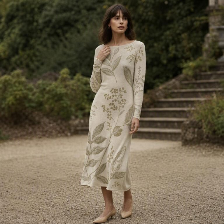
Florals
Florals are where many beginner designs get over-detailed.
What works best:
Simplified petals and leaves with clear negative space.
High value contrast (light vs dark), not just “different colors.”
Common failure: A pretty illustration that becomes mushy because the stitch grid can’t resolve it.
If the flower needs fine linework, consider a hybrid: knit a simplified silhouette and add embroidery for details.
Logos
Logos are less about “can it be knit?” and more about whether it stays recognizable.
Execution notes:
Favor bold shapes and generous spacing.
Avoid thin strokes and tiny counters (the inside holes of letters).
Decide whether the logo must be identical across sizes. If yes, you may want a patch, label, or embroidery instead of knitting the mark into the fabric.
Novelty intarsia (pictorial motifs)
This is the category for big graphics: animals, holiday icons, illustrated objects (dog motifs, cat motifs, horse motifs), plus bold icons like an anchor motif—or sport graphics like ski motifs and golf motifs.
Why it’s popular: It’s high emotional impact and very “fashion.”
Execution notes:
Treat the art as pixel art. You’re designing in stitches.
Keep shapes chunky so edges don’t look stair-stepped.
Expect iteration. This is normal.
Holiday motifs
Holiday motifs (snowflakes, trees, ornaments) are usually repeating geometry, which makes them good candidates for banded colorwork.
Execution notes:
Build a motif system, not one standalone icon. The repetition is what sells the story.
If you plan seasonal drops, consider reusing the same base sweater body and swapping only the motif program to control costs.
Animals
Animal motifs (especially dog motifs, cat motifs, and horse motifs) are where the “resolution problem” shows up fast.
Execution notes:
Think silhouette first. Then add 1–2 defining details.
If the animal has eyes/whiskers/fine outlines, plan to add those via embroidery rather than knitting.
The spec checklist: what to give your factory
Beginners often send artwork and hope the factory interprets it correctly. That’s how you get a “surprise sample.”
Here’s what to include so the sample is a test, not a guess.
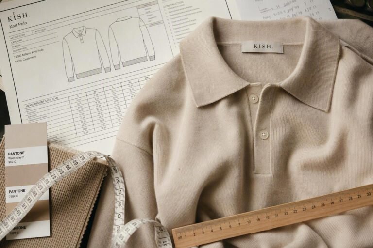
Artwork package
Vector artwork (AI/PDF/SVG) for clean shapes.
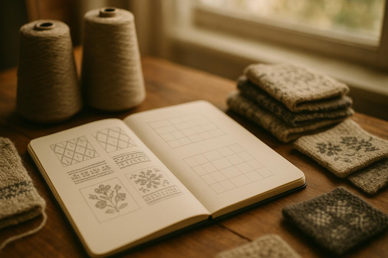
Pixel grid version of the motif (a simple square grid mockup is enough) to show how you expect it to translate to stitches.
Colorways with named colors and (if available) yarn references.
Knit spec anchors (the minimum you should decide)
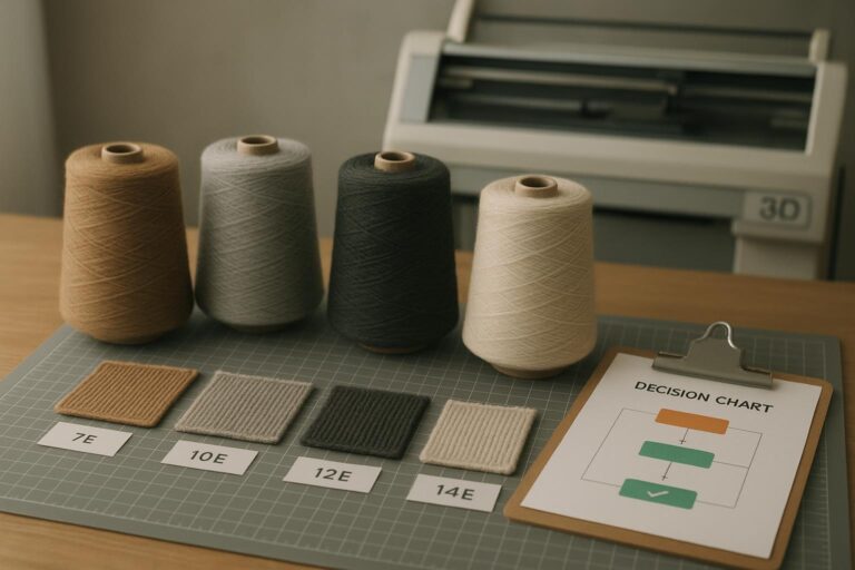
Target gauge range (fine vs mid vs chunky) because gauge controls resolution.
Motif placement with measurements from key points (center front, neckline, hem).
Motif size in centimeters or inches.
Seam and trim notes: don’t put critical details where seams will cut or distort.
Key Takeaway: If you don’t control gauge and motif size together, you don’t control the final look. That’s why swatching and sampling matter.
For a clean refresher on why gauge changes after finishing and why swatches should be treated seriously, see Purl Soho’s “All About Gauge” (2020, updated 2026).
Common beginner mistakes (and the faster fix)
Mistake 1: Designing for a screen, not a stitch grid
Fix: simplify the art until it still reads when you blur your eyes. Then simplify again.
Mistake 2: Forgetting the inside of the sweater
Fix: decide early whether floats/backing are acceptable for the product you’re making (especially for sensitive skin).
Mistake 3: Placing the most detailed part on the stretchiest zone
Fix: put crisp details on more stable areas, and reserve stretch zones for simpler shapes.
Mistake 4: Scaling the same artwork across sizes without rebalancing
Fix: ask for a graded approach. A logo that looks right on size S can look lost on size XL if you simply scale it.
Key takeaways
Start by deciding which family you’re in: texture, colorwork, or applied graphics. That choice determines cost, risk, and how many surprises you’ll see in sampling.
If you need crisp detail (tiny type, thin lines), don’t force it into knitting. Use patches, labels, or embroidery.
For colorwork, the fastest de-risk move is to swatch the actual motif, not just the base fabric.
Control the trio that makes or breaks readability: gauge (resolution), motif size, and placement.
Next steps
If you’re planning a knit capsule, your fastest path is to start with 1–2 motif directions, then test them in swatches or a small sample run before you commit to a full size range.
If you want a broader “from concept to production” view (mood boards, cohesive motif systems, trims, and how to keep a collection consistent), Knitwear.io’s knitwear collection development guide is a useful next read.
If you’re specifically deciding between in-knit graphics approaches, this comparison of jacquard vs intarsia vs prints will help you choose based on handfeel, durability, and sampling reality.
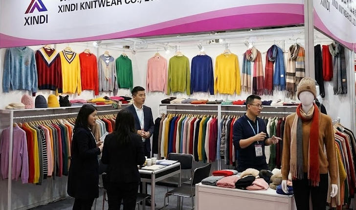
Brand mention: Xindi Knitwear (Knitwear.io) supports low-MOQ development and rapid sampling for custom knitwear, which can help you iterate on motifs without committing to a massive first run.